
Student designers create a new logo, website template and more
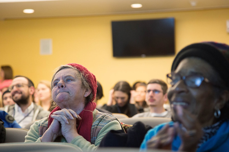
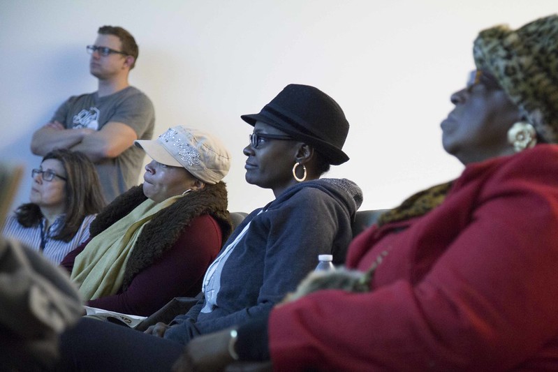
South Side residents partnered with a Syracuse University design workshop last month to complete a rebrand of the neighborhood in 48 hours.
The logo and rebrand unveiling served as the culmination of Pixels & Print, an annual design workshop coordinated by the graphic design department of the S.I. Newhouse School of Public Communications. The mission of the workshop is to create design with social impact.
Graphic design students, under the direction of various design and art coaches — some alumni and all professionals in their field — created a logo, website template, a six-part promotional poster series and swag, a redesign for a community paper website and eNewsletter, a zine idea, interactive maps and social media resources. This was all done in an effort to cultivate a culture change for the city’s South Side Tomorrow’s Neighborhoods Today.
Students considered accessibility in their designs as well by suggesting TNT use free programs and software. Moving forward, the various TNT task forces could edit joint documents using Google Docs and share upcoming community events on a Google Calendar online.
A re-envisioned community newspaper could be printed on standard 8- by 11-inch paper at the library like a zine and then shared with friends.
Kuan Luo, a Newhouse alumna and publication coach for the redesign, said the limited time the students got to work on the rebrand actually helped in providing a sense of urgency, comparable to the atmosphere at a design company.
“Limitation is a great thing for design,” said Luo, who served as The Stand’s first graphic design assistant in 2010 when she was a senior at the Newhouse School.
“The students knew what the real-world situations would be like where you need to make things work with limited time and without all the necessary resources, so I was very impressed,” she said.
Rachel Schwartz, a Newhouse sophomore majoring in graphic design who worked on the publication team for the redesign, attributed the efficient work done by her peers to the support and determination shown by South Side community members.
“The coaches were so helpful with anything we needed, but in all honesty, the driving factor behind the students doing such great work so fast was the overwhelming support from TNT and South Side community members,” Schwartz said.
“You could really tell how excited and moved they were when they saw the new logo for the first time, and that ultimately gave me the most gratification of being a part of this,” she said.
The redesign was significantly special for Geneva Hayden, a South Side community member who has run several summer and after-school programs for community members over the years.
“You’re truly amazing,” Hayden proclaimed in reference to the various teams that constructed the redesign.
“This is a culture change,” she said, “because I’ve been working with this community for 30 years, and the incredible work done by these students is the step in the right direction that we’ve been needing.”
Camille Coakley, a TNT delegate and a board member of The Stand, played a major role in connecting the South Side to this design workshop by applying to be a client.
“Ours was unanimously selected,” she said during a previous TNT meeting to announce the workshop.
But Coakley is just one of many South Side residents trying to improve her neighborhood.
She views the rebrand as a stepping stone for a struggling community, as it provides people in need with a true identity.
“I think we have so many boroughs in the South Side that some people don’t even know what neighborhood they live in,” Coakley said. “So I think that we’re trying to establish that and really promote the assets of each neighborhood.”
Coakley also commended the work of the students and coaches, stating that the end result embodied exactly the idea that TNT had in mind. The logo chosen featured a heart at its center with six color blocks surrounding it, appearing almost as beams of light. The surrounding blocks represented the South Side’s six neighborhoods, and the heart stood for the love TNT members hold for their area.
Neighborhood signage, including a welcome sign to be placed on the edge of downtown leading into the South Side at Billings Park, was also part of the collaborative project.
Students incorporated iron work into the railing along with the slogan TNT members proposed, which is “South Side: Soul of Syracuse.”
Coakley said of the students involved: “They really wanted to know what we wanted. We gave them notes, and a day later, they just nailed it.”
— Article by Nate Band and Ashley Kang, The Stand staff